Bring the Thunder campaign refresh.
A seasonal campaign needed higher urgency and clearer entry points. We rebuilt the visual system to spotlight the offer, unify launch assets, and guide visitors to the signup path.

Project snapshot
Deliverables: campaign identity, landing page design, social templates.
Timeline: 3-week sprint with staged approvals.
The challenge
The previous launch relied on scattered assets with mixed messaging. Entry points were unclear, so potential attendees struggled to understand the offer quickly.
The approach
We tightened the visual hierarchy, led with the main benefit, and introduced a campaign system that scaled across web, email, and social channels.
Goals and constraints
Increase urgency without sounding pushy, and make the offer clear in under five seconds.
Align assets across web, email, and social with a tight launch calendar.
Strategy and execution
Defined a three-tier message hierarchy: hook, value, and action.
Built a flexible visual system with bold hero blocks and modular callouts.
Before and after
Clearer entry points and a stronger visual hierarchy improved the campaign flow.
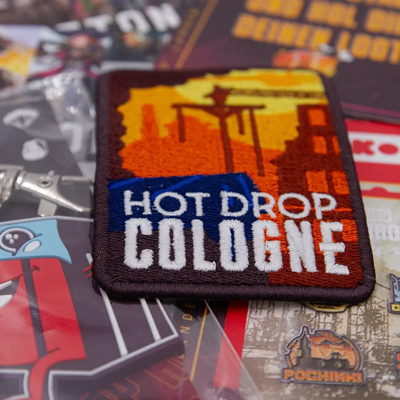
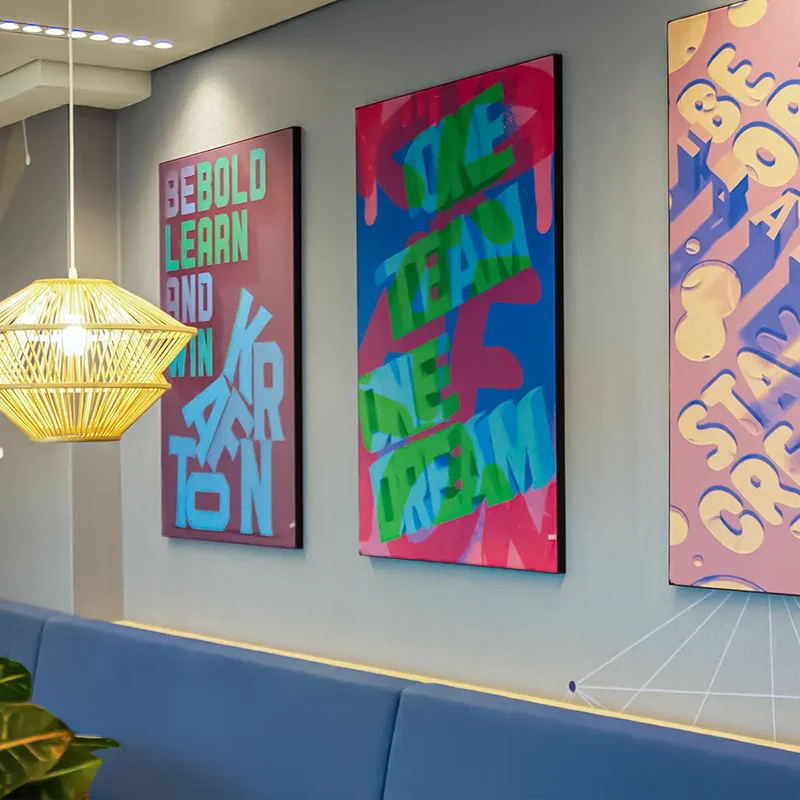
Gallery
Launch assets across key touchpoints, built to stay consistent under tight timelines.

Outcome
Clearer conversion path and stronger urgency during the launch window.
Higher intent traffic and cleaner sign-up flow.
Client feedback
"The refreshed visuals gave the campaign real momentum. We finally had a clear story to lead with."
Marketing lead, live events
Need launch-ready campaign visuals?
Share your goals and we will map the design work that gets you there.